10 Trends design UX/UI Mobile in 2022
After the updated website trend in 2022, today we are introducing the UX/UI mobile design to see what it is in 2022.
For the benefit of those who are developing applications. Let’s see what updates are on the lists design UX/UI, is what we are doing outdated?
What’s UX and UI and how are they different?
Emoji is Everywhere
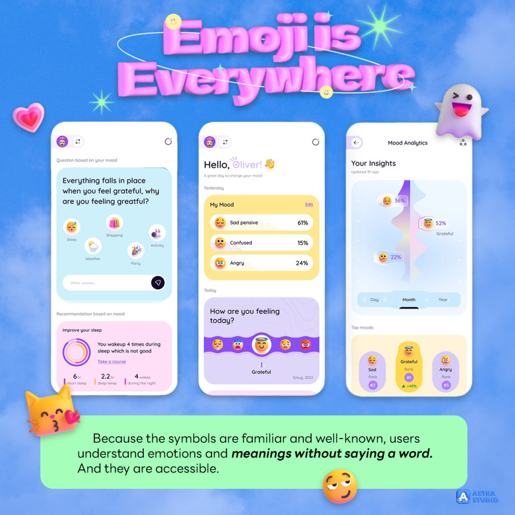
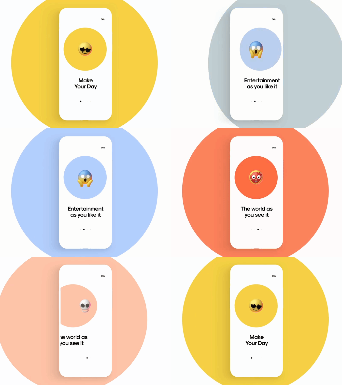
Not only using emojis exist in texting, but application designers have also brought emojis into creating applications. Because the symbols are familiar and well-known, users understand emotions and meanings without saying a word. And they are accessible. Otherwise, using emojis is good, but in another way, think about business appropriation.
Neumorphism
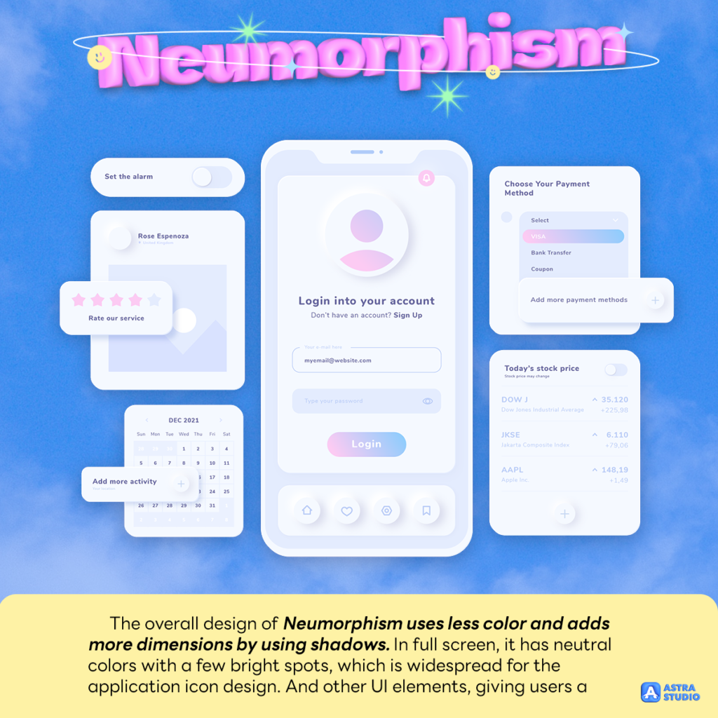
Neumorphism is an evolution of both Skeuomorphism and flat design. Skeuomorphism is a design style in which the shape of elements, texture, and color are in real-world objects, and the image works by Flat and 3D graphics.
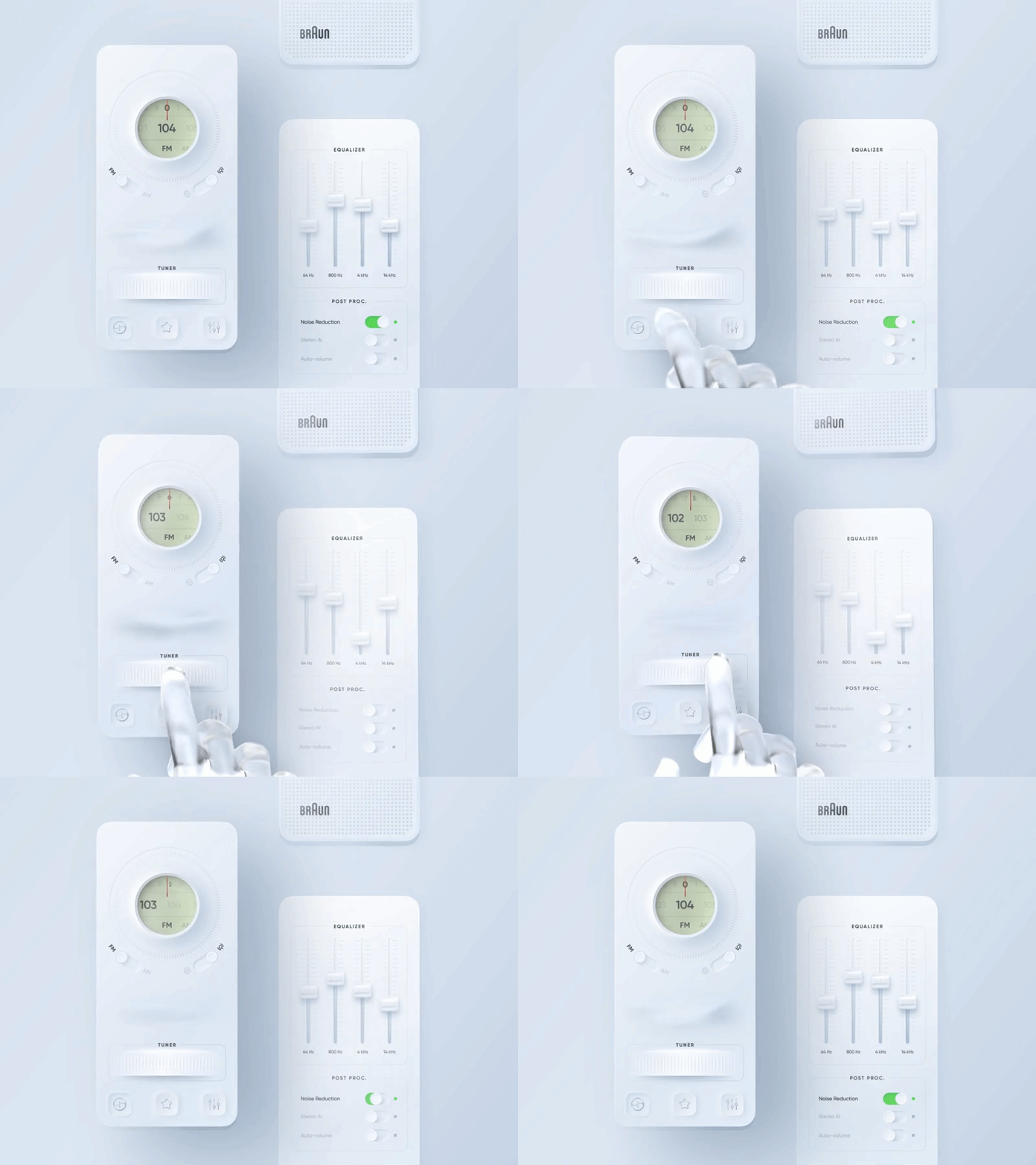
The overall design of Neumorphism uses less color and adds more dimensions by using shadows. In full screen, it has neutral colors with a few bright spots, which is widespread for the application icon design. And other UI elements, giving users a deep sense of cutting-edge.
Animation is always on hit lists
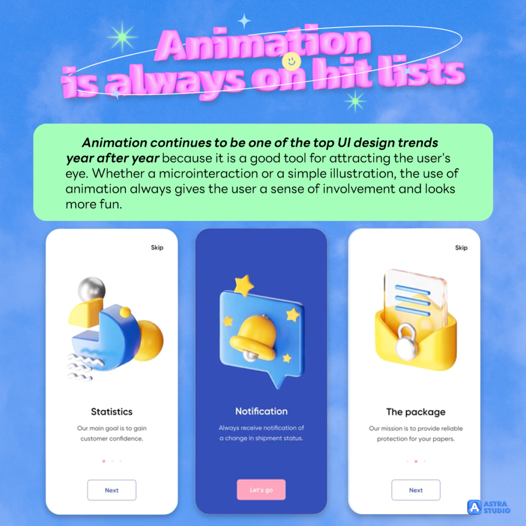
Animation continues to be one of the top UI design trends year after year because it is a good tool for attracting the user’s eye. Whether a microinteraction or a simple illustration, the use of animation always gives the user a sense of involvement and looks more fun.
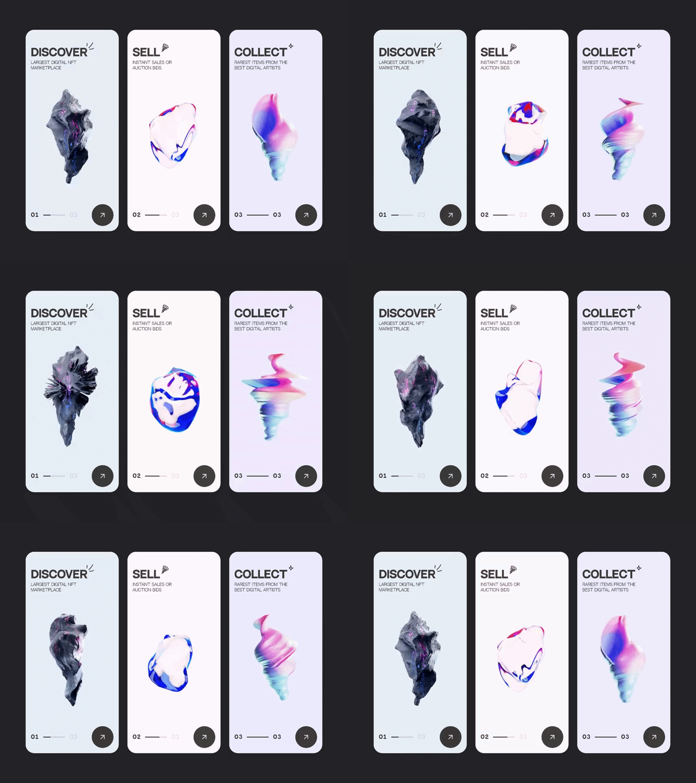
Statistics show that most people watch an explainer video before using the app. The trends of animation and motion design make users’ content more engaging. You can animate your font style, add an illustration to the “Getting Started” screen, or even make the navigator application easier.
Dark Mode
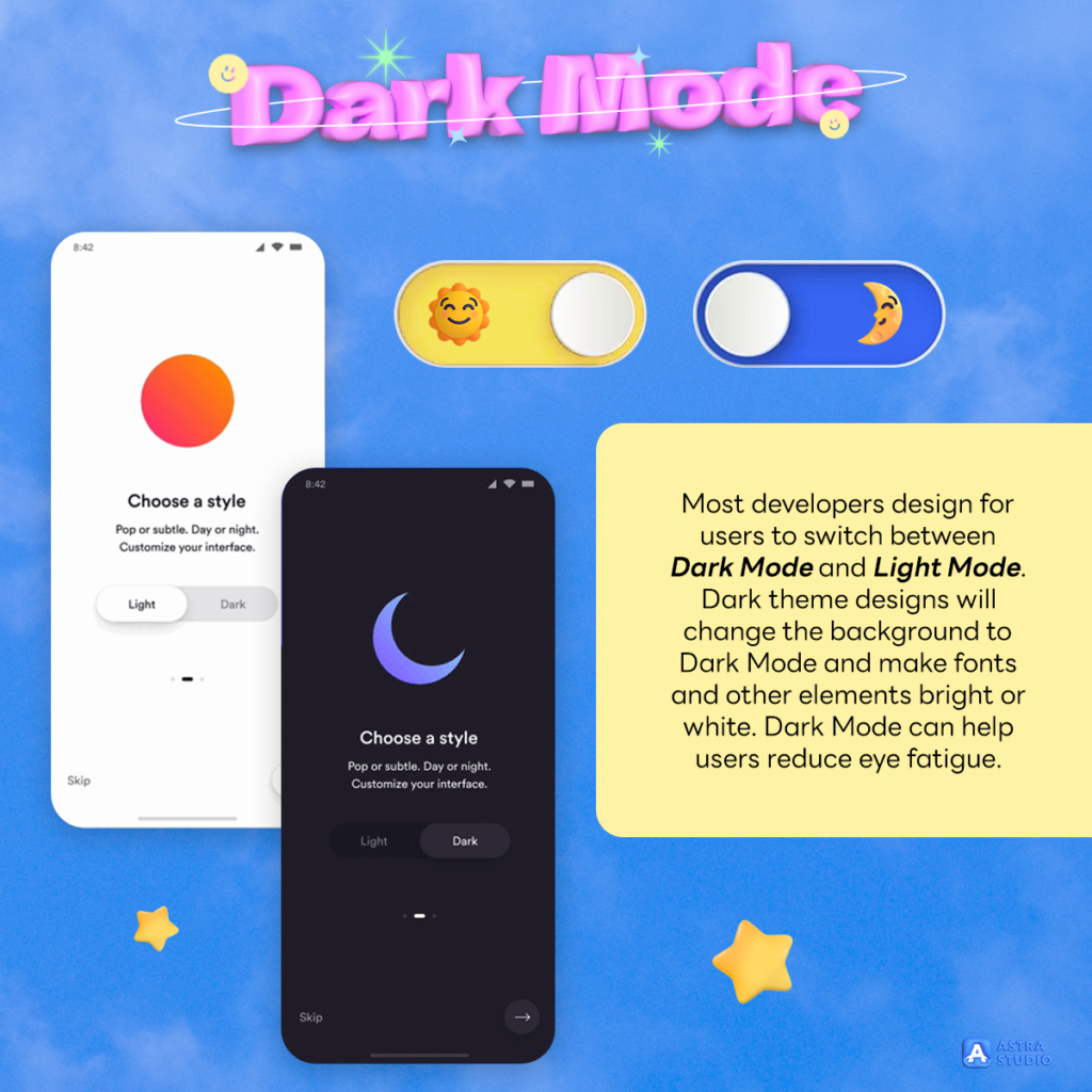
Whether it is a website or an application, the most popular feature of this period is Dark Mode, which is widely used everywhere. Most developers design for users to switch between Dark Mode and Light Mode.
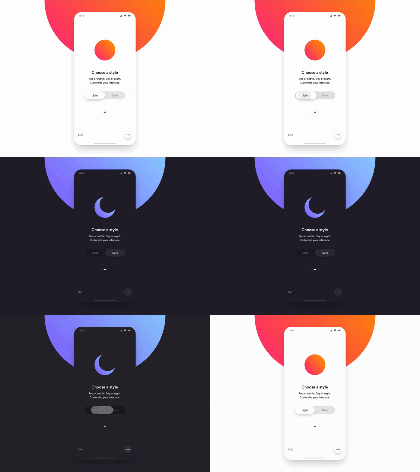
Dark theme designs will change the background to Dark Mode and make fonts and other elements bright or white. Dark Mode can help users reduce eye fatigue.
Gestures and Swipes
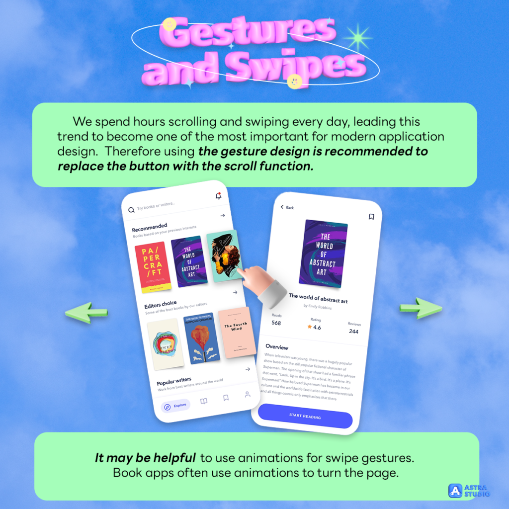
The touch and scrolling experience are features that every mobile phone can do. Besides, easy to use, and also gives a smooth feeling to use the app.
We spend hours scrolling and swiping every day, leading this trend to become one of the most important for modern application design.
Some app creators do not support the buttons at all. Because creating buttons feels cumbersome and takes up too much space on the screen. Therefore using the gesture design is recommended to replace the button with the scroll function.
It may be helpful to use animations for swipe gestures. Book apps often use animations to turn the page.
Typography
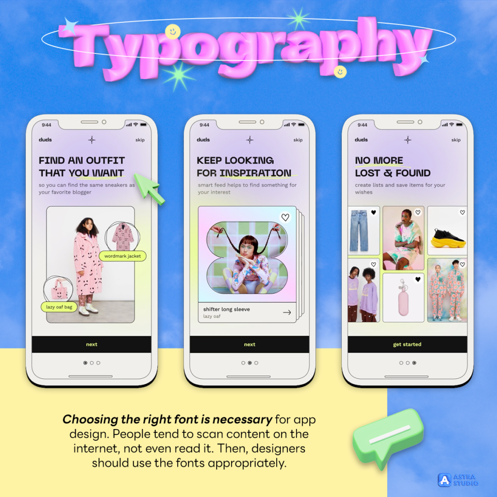
Choosing the right font is necessary for app design. People tend to scan content on the internet, not even read it. Then, designers should use the fonts appropriately.
App designers are starting to use unknown fonts to catch attention, not boring, and not blend with the background. The purpose is to make the text brighter and more outstanding.
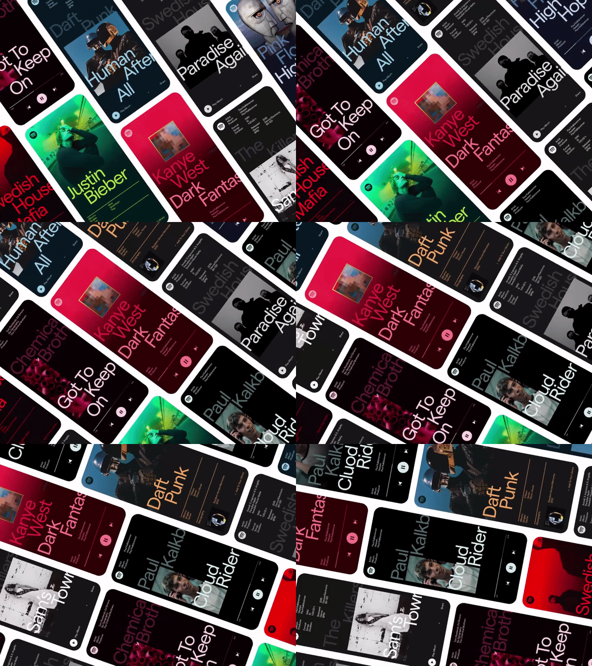
Examples of using front correctly:
- Set the tone and mood
- Increase brand awareness
- Give a better visual experience
- Improve reading ability
Make app users have a pleasant and readable experience by formatting fonts: set point size, line spacing, line length, tracking and scaling, and make layouts more interesting.
Gradients and Transparents
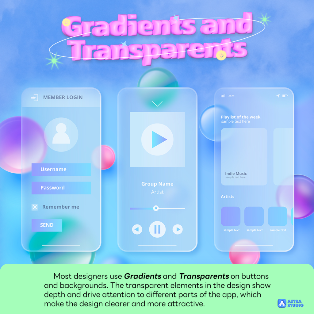
Most designers use Gradients and Transparents on buttons and backgrounds. The transparent elements in the design show depth and drive attention to different parts of the app, which make the design clearer and more attractive.
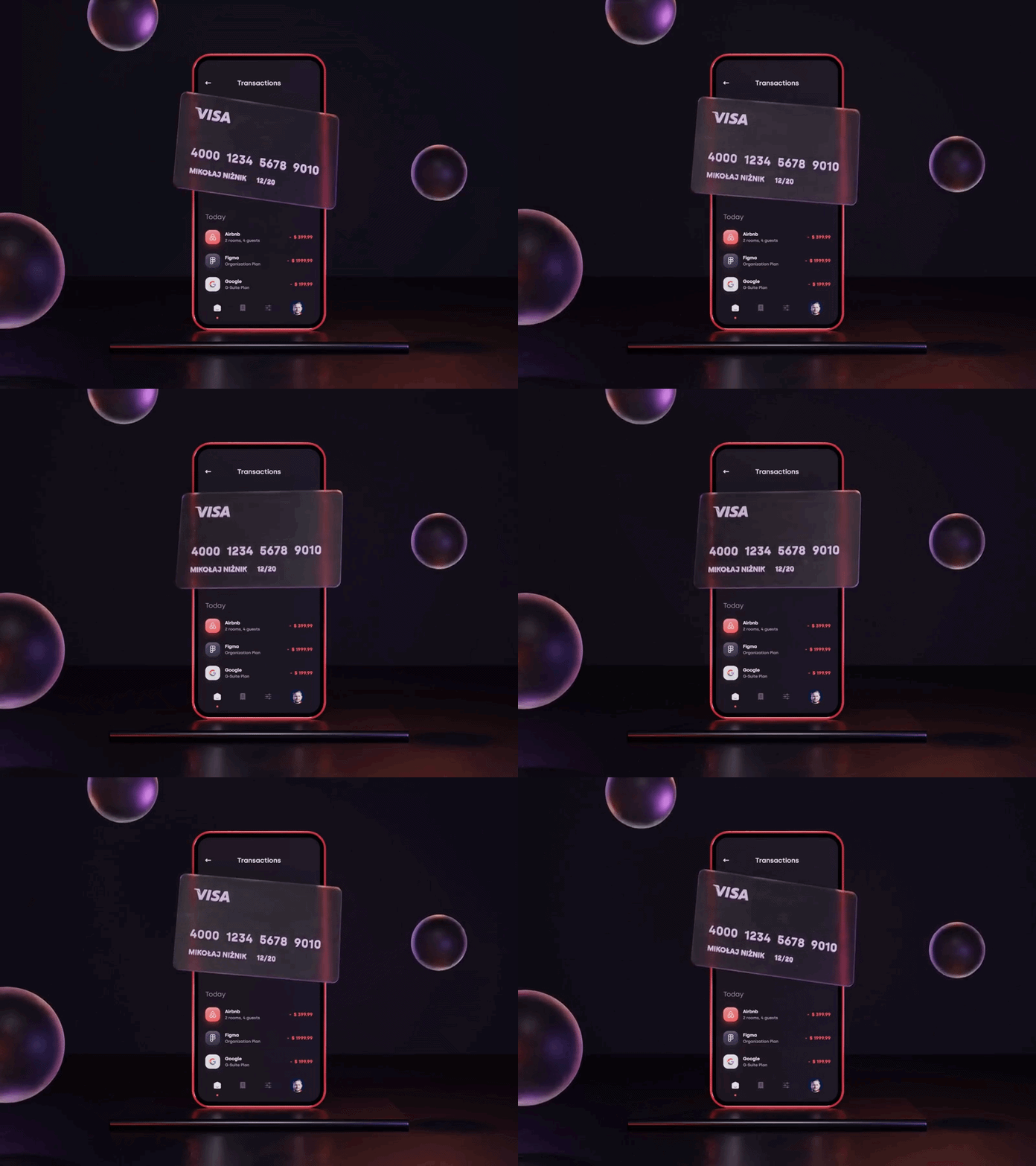
The concept of Glassmorphism reduces the contrast between light and dark design elements by using a transparent blurred background design, which is similar to the texture of a matte glass.
Main characteristics of Glassmorphism:
- Transparent and blurred background
- Thin light edges on transparent objects
Face ID and Touch ID
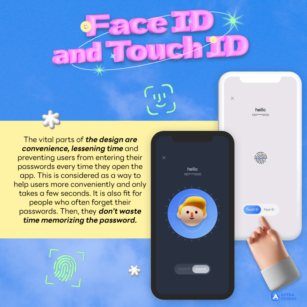
The vital parts of the design are convenience, lessening time, and preventing users from entering their passwords every time they open the app. This is considered as a way to help users more conveniently and only takes a few seconds. It is also fit for people who often forget their passwords. Then, they don’t waste time memorizing the password.
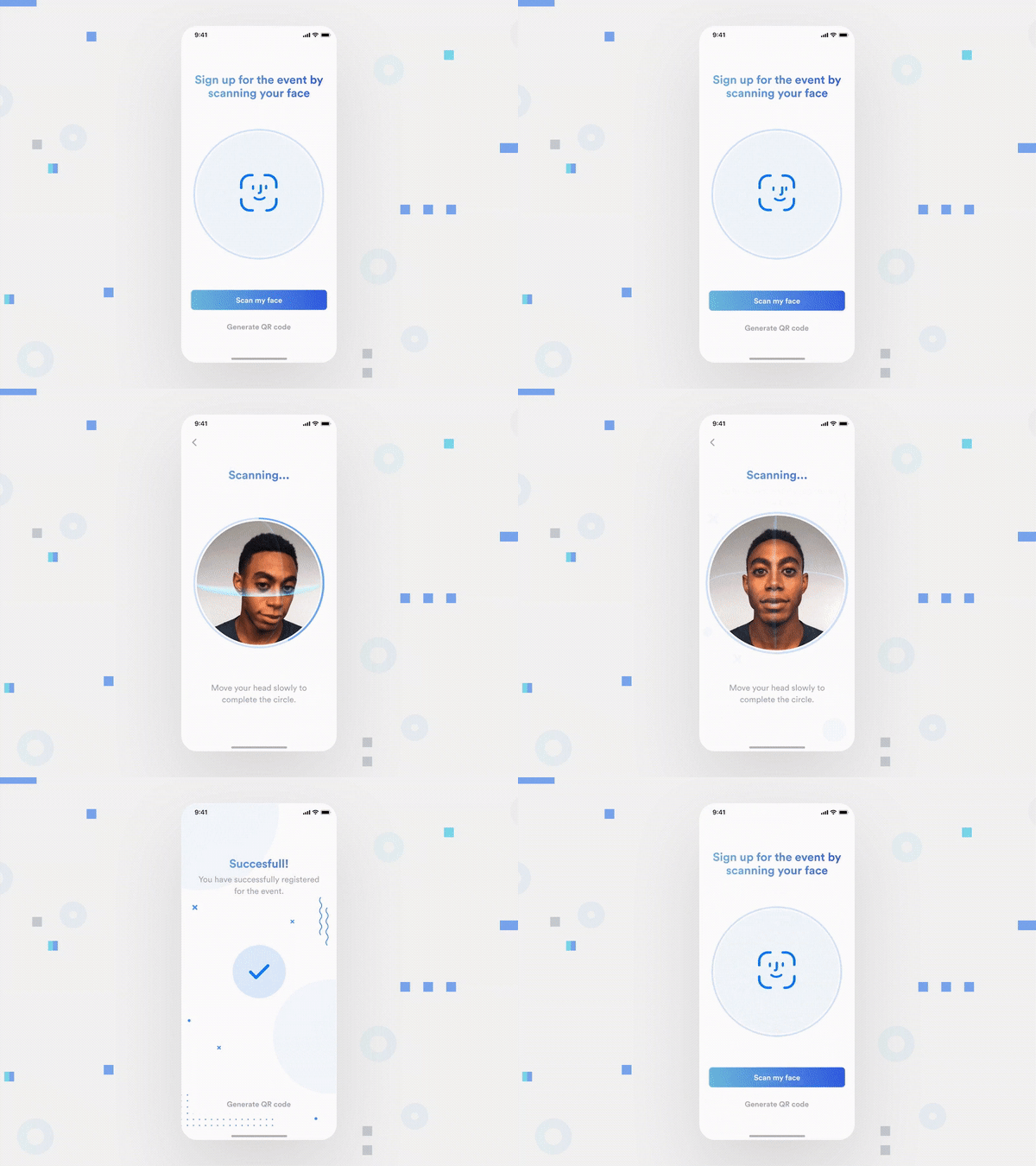
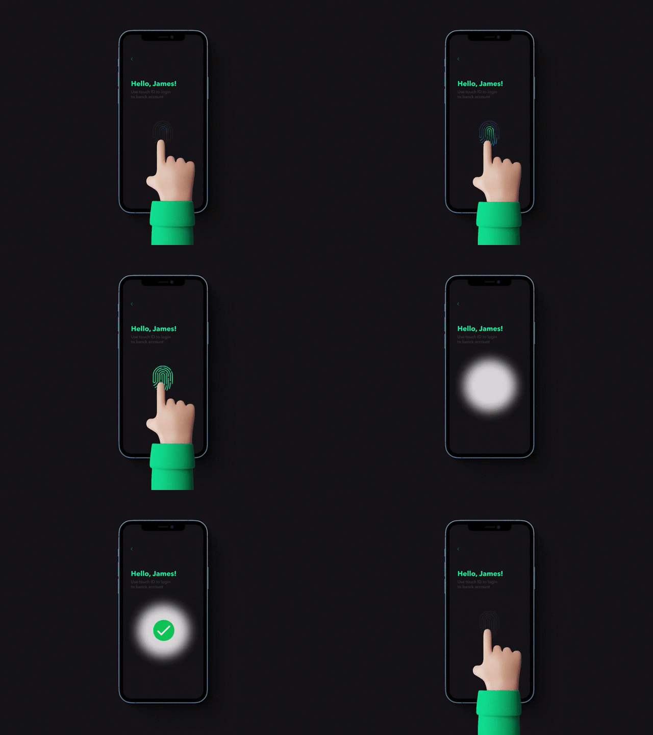
This pattern is becoming a common practice for all kinds of applications. They not only make the life of users easier but also add another layer of security. And it is likely that in the future most people will forget their passcode with Face ID and Touch ID.
AR and VR
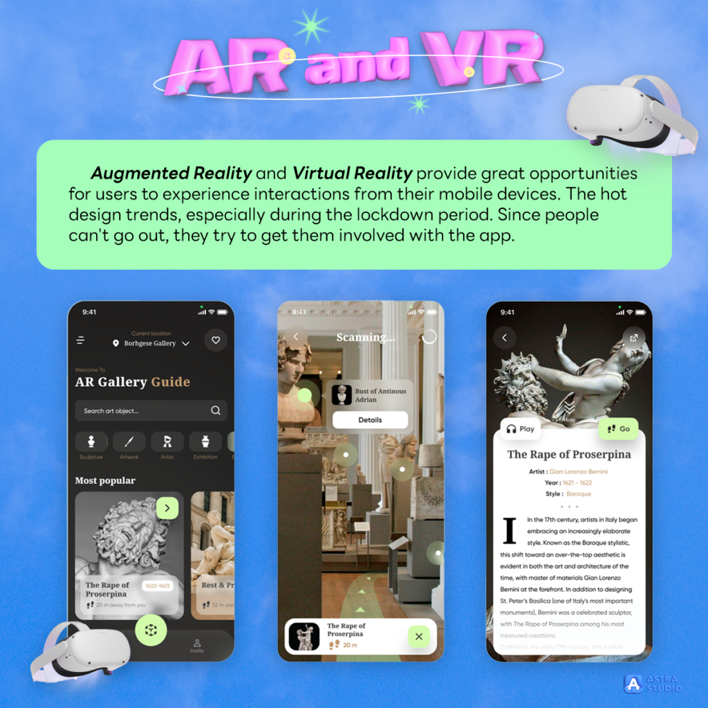
Augmented Reality and Virtual Reality provide great opportunities for users to experience interactions from their mobile devices. The hot design trends, especially during the lockdown period. Since people can’t go out, they try to get them involved with the app.
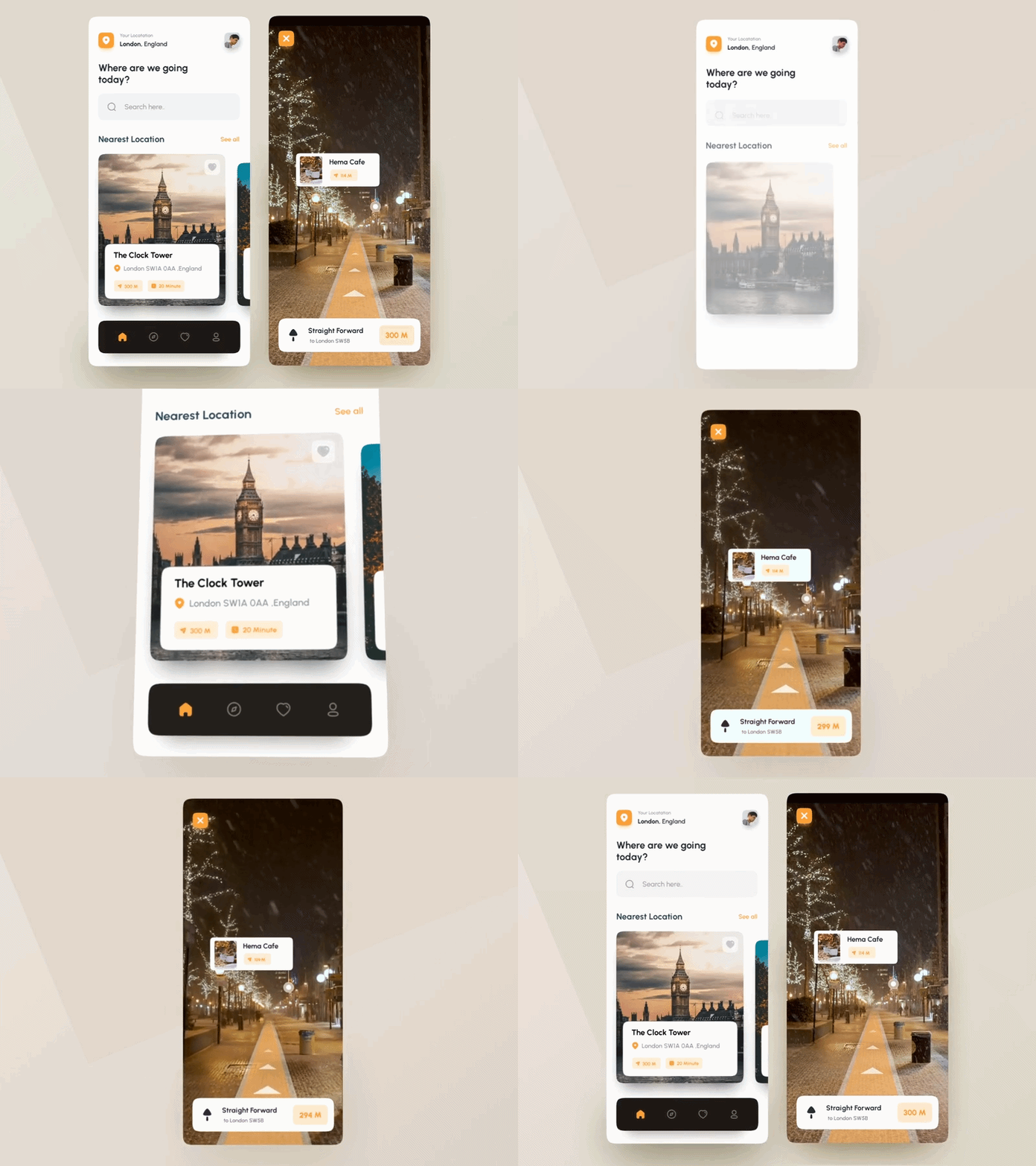
For example, IKEA uses AR to show how a piece of furniture will look in different parts of your home.
Comfy for the eyes
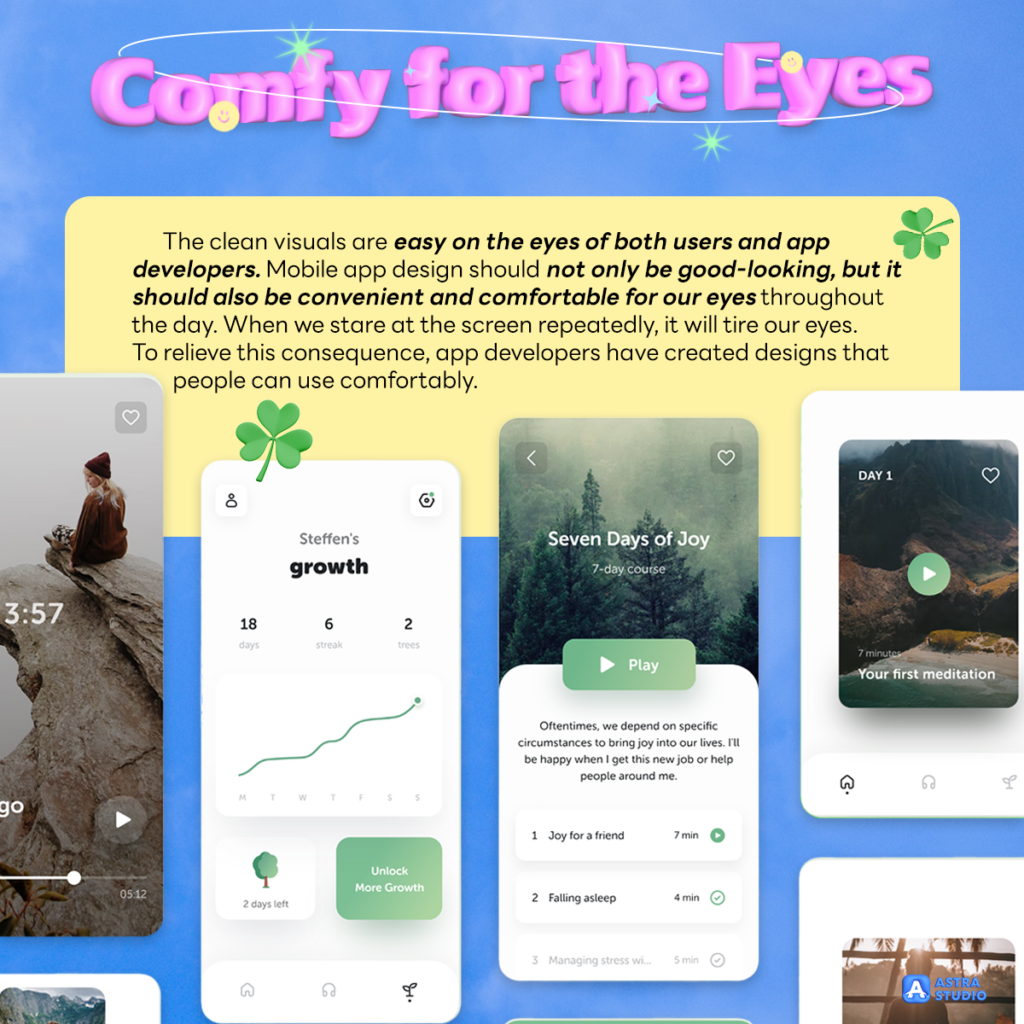
The clean visuals are easy on the eyes of both users and app developers. Mobile app design should not only be good-looking, but it should also be convenient and comfortable for our eyes throughout the day. When we stare at the screen repeatedly, it will tire our eyes. To relieve this consequence, app developers have created designs that people can use comfortably.
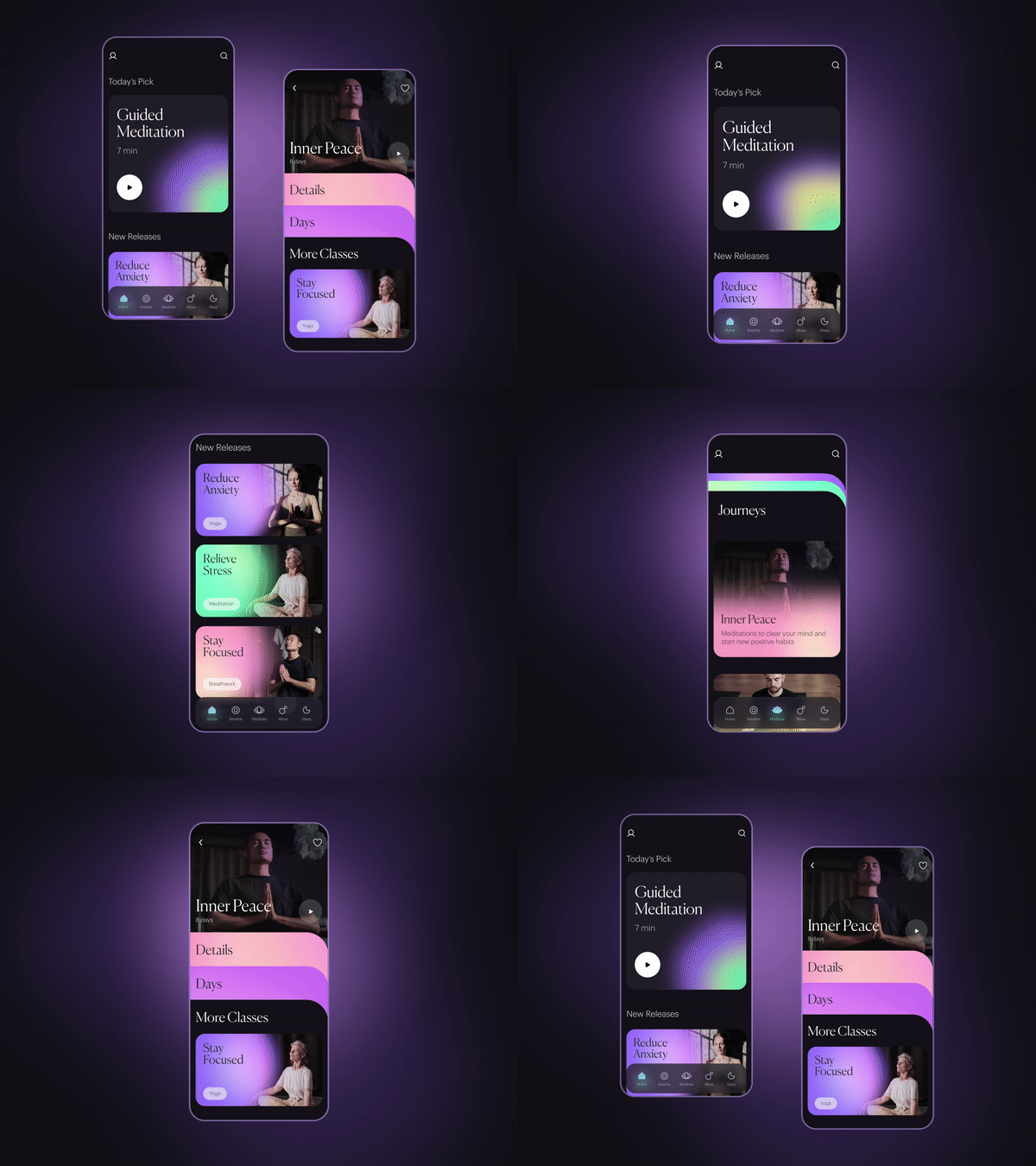
The concept of comfortable visual design trends is the use of natural colors, relaxing pictures, and a simple layout for the app. These techniques can be found in meditation apps, which contain authentic nature photos with calm colors, and light elements with a simple structure and peaceful theme design.
Noticeably, most of the trends we have discussed previously, such as dark mode or real-life photography, have become a common practice nowadays. And these are what we should keep in mind about the trends: while some trends may come and go, many trends become best practices. Therefore, adopting these early will make you a leader before others.
If you’re thinking about designing your application to be trendy and catchy, Astra Studio offers full services to help you from start to finish. Including, bringing your applications to App Store and Googleplay, no problem. If you’re interested, contact us for more information for free through these channels
Please make sure you do not miss any updated news by following our social media as follows:
Facebook: https://www.facebook.com/astrastudio.digital
Medium: https://medium.com/@AstraStudio
Website: https://astrastudio.digital/


