14 Interesting Color Schemes for Creating a Website
Color is an important part of everything and should be focused on. So, applying colors to the website is necessary for designers too.
The use of colors contributes to drawing users’ attention and shows the company’s image.
This is one of the main reasons that “color” is the most powerful tool of UI designers. Even though many designers, or most professionals, sometimes cannot find the right color for their work or project.
Therefore, most of the time is spent searching for the perfect color tone. Today, we have collected interesting color schemes for making websites to develop ideas for everyone with some interesting color schemes. In the design work, examples from here https://www.awwwards.com/
5 Ways to Make Beautiful Fonts for UI Design giveaway tools to use for free!
Color and Balance

Warm and cool tones blend but keep the balance without being overbearing, from attractive azure green to earth tones. These color schemes work well for young and modern designs.
Bright colors
The shades of blue and purple meld with eye-catching reds and oranges in this blend. Notice the difference between the bright blue background and the red-orange can immediately draw the eye to the right spot, from the top of the page down to the video at the bottom-make users see better clearly.
Nature and Land

The feeling of being surrounded by the comfortable blue sky and outdoor atmosphere will suddenly be awakened by a “natural” color scheme, ideal for nature-related designs. Also, this color combination can be helpful in environmental awareness projects.
Cool and Refreshing
Deep imperial blue and emerald green come together in this scheme to create a clean, fresh color- reminded of the ocean or water scenes. This combination is perfect for designs that want to convey a calm and reliable look.
Fearless and Lively
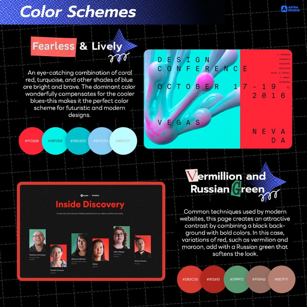
An eye-catching combination of coral red, turquoise, and other shades of blue are bright and brave. The dominant color wonderfully compensates for the cooler blues-this makes it the perfect color scheme for futuristic and modern designs.
Vermillion and Russian Green
Common techniques used by modern websites, this page creates an attractive contrast by combining a black background with bold colors. In this case, variations of red, such as vermilion and maroon, add with a Russian green that softens the look.
Stylish and Sophisticated

This luxury color scheme combines dark tones to create a clean and sophisticated look. Shades of gray and blue are perfect for simple, elegant designs.
Dark purple and Blue
This dark, mysterious color scheme with bright blue follows a widespread web design trend: using a dark background color with bright colors to make images stand out.
Contemporary and Bold
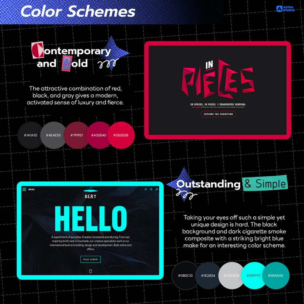
The attractive combination of red, black, and gray gives a modern, activated sense of luxury and fierce.
Outstanding and Simple
Taking your eyes off such a simple yet unique design is hard. The black background and dark cigarette smoke composite with a striking bright blue make for an interesting color scheme.
Textures and Dynamics

Dark sienna, charcoal, and soft magenta make this a must-have color scheme for those looking for a sophisticated yet vibrant look. This color combination can be used in many ways, from modern-looking corporate reports to magazines.
Minimal and Warm
Eggshell white, dark vanilla, and gray with red jelly bean highlights come together in a simple yet warm website. A lively look is a design that simultaneously makes the website look simple and attractive.
Clean and Powerful
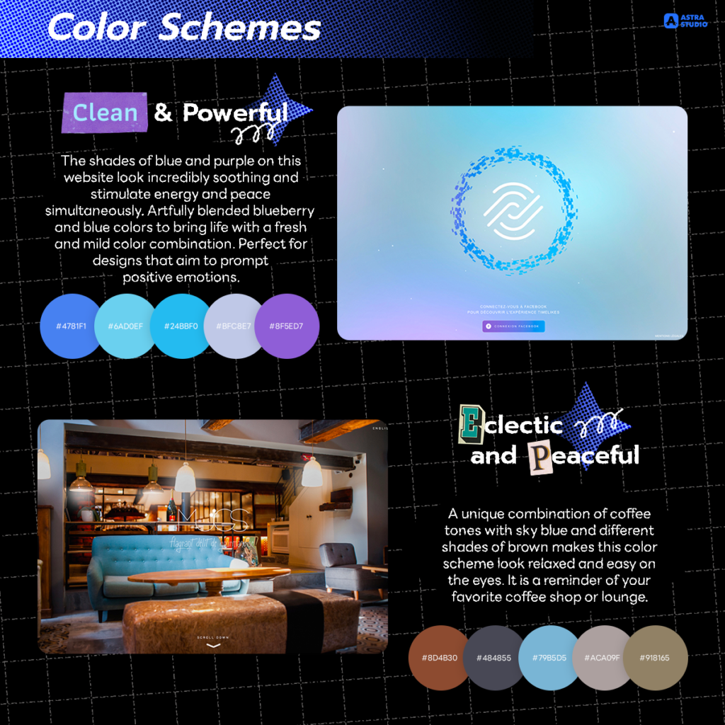
The shades of blue and purple on this website look incredibly soothing and stimulate energy and peace simultaneously. Artfully blended blueberry and blue colors to bring life with a fresh and mild color combination. Perfect for designs that aim to prompt positive emotions.
Eclectic and Peaceful
A unique combination of coffee tones with sky blue and different shades of brown makes this color scheme look relaxed and easy on the eyes. It is a reminder of your favorite coffee shop or lounge.
The use of colors for the UI has many tones, and it’s important to use colors to connect with your business. This will be easy if you work with Astra Studio because we have a team of experts who can help you. Let’s make your website stand out with our website-making service.
Please make sure you do not miss any updated news by following our social media as follows:
Facebook: https://www.facebook.com/astrastudio.digital
Medium: https://medium.com/@AstraStudio
Website: https://astrastudio.digital/
